
How to Build Landing Pages That Print Money: A Step-by-Step Guide
Most ad accounts lose more money on the landing page than in the platform. If traffic is expensive and attention is short, the page has to do the heavy lifting. Great landing pages share three traits you can ship in weeks. They load fast, they build trust in seconds, and they present an offer that feels too good to pass up.
Here is the simple why behind each trait. Google reported that as mobile page load time increases from 1 to 3 seconds, the probability of bounce jumps by 32 percent, and from 1 to 5 seconds it rises by 90 percent. Google has also shared that 53 percent of mobile visits are abandoned if a page takes longer than 3 seconds to load. Deloitte’s Milliseconds Make Millions study found that a 0.1 second improvement in mobile site speed increased conversion rates by 8 percent for retail and 10 percent for travel. Faster pages get more of the clicks you already paid for. The Baymard Institute found that about 18 percent of U.S. shoppers have abandoned a cart because they did not trust the site with their credit card information. Trust is not decoration. It is conversion. And because users typically read only 20 to 28 percent of a page according to Nielsen Norman Group, your copy and layout must be scannable.
Step 1: Make it fast in the ways that matter
Google’s Core Web Vitals are your plain English speed checklist. Aim for Largest Contentful Paint at 2.5 seconds or faster, Cumulative Layout Shift below 0.1, and Interaction to Next Paint below 200 milliseconds. These scores improve user experience and can boost Quality Score in Google Ads, which lowers effective CPC.
Quick wins anyone can do
- Shrink what loads first: Keep your header image light, inline only critical CSS, and delay anything the visitor does not see immediately.
- Fix images: Export at the exact size you need, convert to WebP or AVIF, and use a CDN to deliver them quickly.
- Trim scripts: Audit tracking pixels, remove anything you do not use, and set marketing tags to load after the main content.
- Cut bloat: Disable heavy theme features on landing pages and only ship the blocks you need.
- Measure with real users: Watch Core Web Vitals in the field, not just lab tools, and set alerts when they slip.
Layman’s version: smaller pictures, fewer add ons, and less code means the page shows up faster. Faster pages keep people around long enough to take action.
Step 2: Build trust above the fold, then keep proving it
Trust earns the right to ask for a click or a form fill. You do not need an entire brand story. You need specific trust signals where the eye lands first.
Place these elements where they get seen
- Logos and proof near the CTA: Show client logos, review counts, or media mentions next to the main button.
- Clear policies: Link to privacy, refund, or warranty details and restate the key promise near the form.
- Real people: Add a founder or team photo and a phone number or address for credibility, especially for local services.
- Specific testimonials: Use names, roles, and outcomes. “Cut cost per lead by 28 percent in 45 days” beats “Great team.”
- Explain what happens next: One sentence on how you handle data and what the user should expect after submitting.
Layman’s version: show me others trust you, show me you are real, and tell me exactly what happens if I click.

Step 3: Craft an offer people feel safe saying yes to
Clarity beats cleverness. Your offer should be outcome led, risk reduced, and supported by a clear value stack.
Offer checklist
- Lead with an outcome: “Get 20 percent more qualified leads from the same ad budget” is better than “Advanced optimization.”
- Reduce risk: Use a free audit, free trial, or money back guarantee where appropriate.
- Build a value stack: List the main deliverable, add 2 to 3 bonuses, and set a real deadline or capacity limit.
- Match the ask to the temperature: Cold traffic gets a low friction micro offer. Warm remarketing gets the full consult invite.
- Keep the form lean: Ask for the minimum. Explain why you need each field and use progressive profiling later.
Layman’s version: promise a result, make it feel safe, and do not make me work hard to get it.
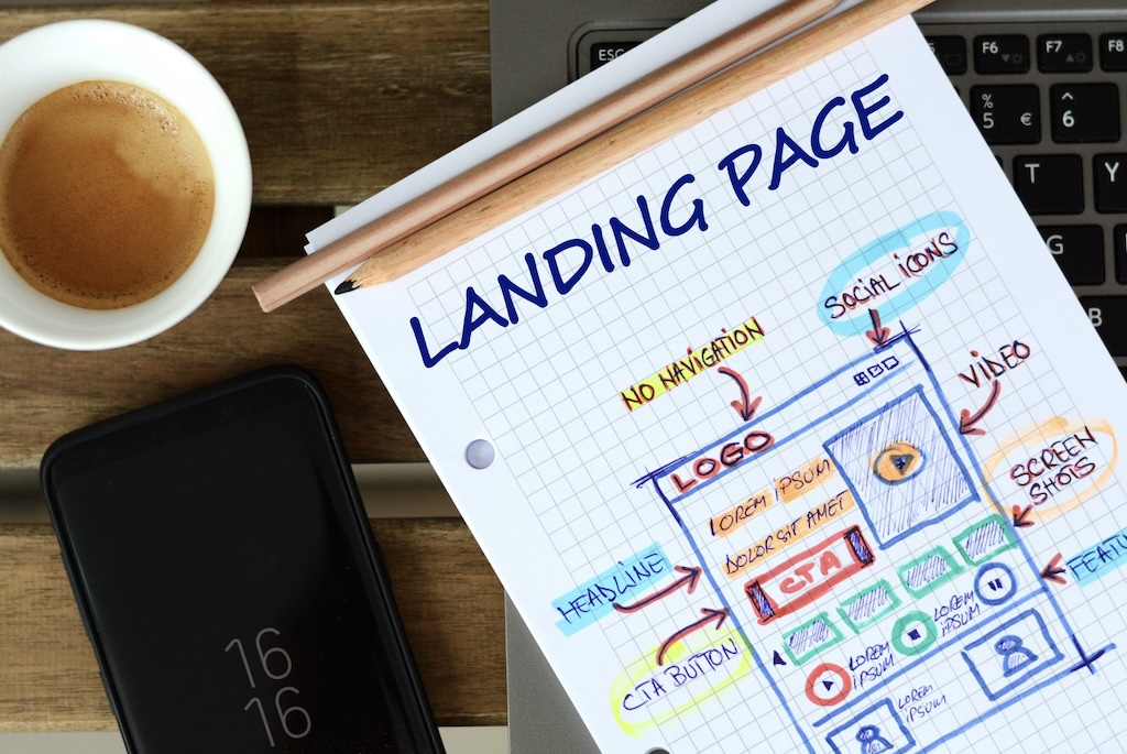
Step 4: Use a layout that guides the eye and the thumb
Design should serve decisions, not decoration. Build the page for scanners.
Hero section formula
- State the problem and promise the outcome: Clear headline with a number if you have it.
- Add a short subhead that explains how: One or two lines only.
- Show proof and reduce risk: Trust badges, testimonial snippet, or guarantee.
- Give one primary action: A single, high contrast button that matches the headline promise.
Write for scanners - Use short sentences and bullets: Break ideas into chunks people can glance at.
- Make the next step obvious: Primary CTA plus one softer option like a 90 second demo or checklist.
- Design for mobile hands: Keep buttons large and reachable without stretching the thumb.
Layman’s version: big promise, quick proof, one button to click. No carousels, no autoplay, no overload.
Step 5: Follow this 90 day plan
You do not need a redesign. You need a focused build, test, and scale loop.
Weeks 1 to 2: speed and tracking
- Audit and fix: Optimize media, defer scripts, remove unused apps, and confirm Core Web Vitals on real devices.
- Tracking foundation: Map GA4 events to your funnel and ensure conversions only fire on success states. Use server side tagging if your stack supports it.
Weeks 3 to 6: offer and trust - Offer workshop: Define the strongest promise you can safely make, package bonuses, and set a risk reversal.
- Proof collection: Gather 3 to 5 short case snapshots with numbers, request reviews, and secure logo permissions.
- Wireframe and copy: Draft the hero, three proof blocks, objection handling, and a short FAQ on price, timing, and next steps.
Weeks 7 to 10: variants and tests - A/B testing order: Test the hero headline and CTA first, then the offer framing, then the form length. One change at a time.
- Traffic alignment: Route brand and high intent search to your higher friction offer. Send cold paid social to a micro offer and nurture sequence.
Weeks 11 to 12: scale and safeguard - Quality loop: Import offline conversion data and closed won status back into Google Ads and Meta to optimize for quality, not just volume.
- Standardize: Turn the winner into a modular template you can reuse across campaigns.
Step 6: Measure what leaders care about
Report on outcomes over vanity metrics. Track conversion rate by channel, cost per qualified lead, pipeline generated, revenue per session, and time to first value. Keep Core Web Vitals in the report so you do not trade speed for fancy pixels that do not move revenue.
Attribute in a way that helps decisions. Use GA4 event names that mirror your CRM stages, import offline conversions to ad platforms, and run simple geo or time based lift tests to understand incrementality. Automation performs better when it sees the true signal.
Common blockers and simple fixes
Heavy theme slowing you down? Create a lightweight landing page template with only the components you need. Security will not approve a script? Load it server side or remove it if it is not critical. Legal slows copy edits? Pre approve a library of proof statements and claims with sources and store them in a shared doc. Team stuck on copy? Record a 5 minute voice memo that answers three questions. What problem do we solve, what outcome can we promise, and what proof do we have. Transcribe it and turn it into a hero, proof block, and CTA.
Why this helps your PPC immediately
Landing page experience influences Quality Score in Google Ads, which can lower CPC and raise impression share for the same budget. Faster pages increase conversion rate, stronger offers increase response, and higher trust reduces drop off. Your blended cost per acquisition falls and your budget reaches more real buyers.
Sources you can trust
Google, Think with Google, The Need for Mobile Speed. Deloitte Digital, Milliseconds Make Millions. Google, Core Web Vitals documentation. Baymard Institute, Checkout Usability. Nielsen Norman Group, How Users Read on the Web.
Ready to turn clicks into customers
Hogan Media Group builds landing pages that are fast, credible, and designed around a clear offer. If you want a practical plan and a partner who will implement it, request a free 5 point landing page teardown. We will highlight the exact fixes that protect your ad spend and unlock more revenue.